Let’s face it, creating images for social media use is a pain, particularly when you’re not a Photoshop guru. Realizing this, the folks at Buffer (creators of the eponymous social media management tool) built Pablo to make it easier to quickly create graphics on the fly. And, instead of monetizing Pablo, Buffer decided to provide it to anyone to use for free (this means you!).
Pablo’s key selling point, “creating engaging social media images in under 30 seconds,” holds true when put to the test. Their built-in database contains hundreds of royalty-free stock images for use as well as hundreds of quotes you can sift through to create the perfect image. Below you’ll find three graphics I created in less than 30 seconds each, formatted in a few different ways. I grabbed totally random quotes and quickly searched for stock images that matched up well enough to illustrate my point.
This image was formatted using their “Square” option so that it would translate well to Instagram.
This image was formatted using their “Wide” option so that it would translate well on Facebook and Twitter. Particularly for cover/ header photos, where long rectangles are ideal.
This image was formatted using their “Tall” option so that it would translate well on Pinterest.
I picked the format of the images above (Square, Wide or Tall respectively) based on what I wanted to do with them. Square for Instagram, Wide for Facebook & Twitter, and Tall for Pinterest. Above and beyond cropping, Pablo provides a couple easy to use editing features, the ability to add (or not to add) text, and the ability to upload a logo. Here’s what the interface looks like when you upload an image of your own that you want to work with.
Here I’m working with a simple image of a coffee cup on a red background that I uploaded to edit.
As you can see above, there are three effects you can easily toggle on or off — Contrast, Blur and Black & White. Though I’ve turned it off above, the contrast is defaulted to “on” in order to darken the image so that white text really pops. You can see what the same image looks like with the contrast toggled on and a quote auto-populated below. Big difference already, right?
Here is the same image shown in the editing menu above with the contrast turned on and a quote auto-populated.
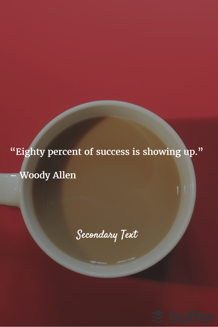
Additionally, if I wanted to add another bit of text and drop a logo onto the image, I can easily do that by toggling the “Secondary Text” and “ Custom Logo” options on the right.
I’ve dropped secondary text in a different font lower in the image and added the Buffer logo in the bottom right corner.
Beauty lies in simplicity here. Pablo offers 10 different font choices with bold and italic variations, 3 font sizes (which are different for primary and secondary text), and the ability to make the text either white or gray. That’s it. The well-curated selection of fonts helps you find one that matches the tone you’re going for without making the decision overwhelming. Additionally, it’s now easy to pick a font color because you only have two options — white for dark backgrounds and gray for light backgrounds. Analysis paralysis no more!
The one resource you’ll need to bring to the table to get the most out of Pablo is your logo. I recommend color, black (or gray) and white versions with transparent backgrounds. After all, great visuals are a must, but you should not be taking the time to create them without ensuring your brand is included.
So let me know what you think of Pablo. I would love to hear about your experiences, good or bad. It certainly isn’t the most robust tool out there, but I think it’s a fabulous option for those of you who aren’t designers at heart.


